But Abero and Chantry couldn't be more different: Chantry, famously wild-haired and voluble and running vintage posters through a paper cutter in the 1996 documentary Hype!; and Abero, quiet, self-contained, with trim glasses and a modesty that borders on diffidence. In essentials, though, they're quite similar. They neither give in nor limit themselves to what technology offers--where Chantry was famously anti-digital, Abero is wholly computerized, but he works slyly against technological trends. Instead of relying on "wacky" fonts to carry a poster, Abero limits himself to about five rather plain fonts, and treats the type in innovative ways--wedging words in between images, balling them up at the side of a poster. He works against the sterility that digital design often creates, for instance by photographing a texture such as a distressed, pockmarked wood floor, and using this texture to soften and deepen a design. There is a new edge of instability to Abero's most recent posters that I think is due to his recent switch from color copy output (then copied again to give the poster a faded quality) to screen-printing; the design seems to come right up against what the screen-print can handle.
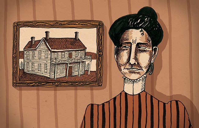
If it's not absolutely necessary, Abero will use as little text as he can get away with--the name of the band, the venue, the date. He likes blank spaces, solid blocks, and simple imagery. He frequently favors a stacked style that lends itself nicely to bands with long or repetitive names: Hot Hot Heat, or the Yeah Yeah Yeahs. With a few exceptions, image takes precedence over text treatment; sometimes an original drawing (such as an enervated Saul Bass-style eye drawing for a Carissa's Wierd show), and often an assemblage of found images (such as a Jake the Alligator Man-plus-clamshell double-exposure-style imposition for the Pale). He has also been known to use his own head as a design element; in one poster for FCS North, he made himself into a giant PEZ dispenser. At times he'll make a rather stunningly literal visual leap (a severed arm for the Dismemberment Plan), and at others the associations are more random.
Abero isn't inclined to think about his work philosophically; much of it evolves out of visual problems solved intuitively. I sat with Abero recently in his Belltown studio and we leafed through his portfolio, talking about the kinds of decisions he makes; his answers were very brief, not particularly quotable, and mostly about what looks good, what works--basic design principles of balance and harmony. It occurred to me that concert posters, which rely on a particularly sly mix of advertising and art, belong more wholly to the realm of pure aesthetic pleasure than any other form of visual culture, including art. Contemporary art is often as much about having your mind provoked and involved as your eyes; where it has moved away from the purely visual, graphic design has moved in (you could argue that art has moved away from the visual due to the omnipresence of graphic design, but that would be a different essay). The result is that you like Abero's posters. Maybe you can't really say why. And that's fine.
All this from a very, very young designer. Abero is 23, with two years of design study at the Art Institute under his belt. While working at a video game company, Abero began designing posters for bands he liked, working for free, printing out posters on a color copier. His design firm, 33 RPM Design, does all the Vera Project posters, as well as posters for the Slender Means Society, EMP, Graceland, the Showbox, and others. He's done album art for Aveo, Spoon, SushiRobo, Jen Wood, and his own band, Asahi. He'll be showing his work this summer at Flatstock 3 at Bumbershoot, a poster show first held in San Francisco in 2002, and then at SXSW in Austin earlier this year. His work will be featured in The Art of Modern Rock, the sequel to Paul Grushkin's giant classic, The Art of Rock.
And one of his posters, which happens to be one of my favorites (for a Drew Victor and Passing Friends show, with a pale green figure casting a narrow Hitchcock-like band of light on a black background), caused something of a stir on gigposters.com--where, in the democratic and hysterically digressive shape that Internet dialogue takes, design and music fans weigh in on matters aesthetic, tonal, and philosophical--that was significant not least because Chantry and Kleinsmith weighed in as well. Chantry posted a question about who Abero was and what his relationship might be to Kleinsmith (whose work Abero's, in some ways, resembles), and provoked an interesting discussion about scene, influence, regionalism, and design as a kind of evolving language.
The nature of fame in poster design has evolved as well. It's no longer the scorched anonymity of the punk scene, with its disposable work; there's a 1986 quote in The Art of Rock from cartoonist Shawn Kerri, who said, "I've never gotten the same thrill out of having one of my cartoons printed in a magazine as much as seeing one of my old fliers--something I did for a punk gig the week before--lying in the gutter. Seeing it all mashed and dirty thrilled me, because that was how I was living, too." Gorgeous posters like Abero's are not so much mass communication as fetish objects, art objects for people in the know--many of them printed in limited quantities and appearing not on telephone poles but in a few record stores and at Vera, and for sale on gigposters.com. Jacob McMurray, who curated Paper Scissors ROCK and is also a part-owner of Patent Pending Industries (a freelance design and printing studio co-owned by Kleinsmith, along with designer Jesse LeDoux and printer Brian Taylor), discovered Abero's posters at SXSW's Flatstock, which is how they then appeared in the EMP show. What began as a street-level subculture is now an industry unto itself--more powerful, more persuasive. But isn't that how the things you love usually move through culture? They go from street to specialist, from private-insider language to recognizable trope--and eventually land in the slick, meaningless mainstream. In a way, Abero represents the high-classical moment of rock poster art: He's the talented, obscure insider who gets credit and recognition for his work. The cynical outsiders are still beyond the gate. The poster movement, for now, is safe.