On one hand, I'm impressed by the bravery of this poster's aggressively minimalist approach. On the other hand, the not-so-eloquent typesetting detracts from the purity of the great red square. A more complementary, subdued selection of type, arranged to support the central image (rather than compete with it) would have been more successful. CORIANTON HALE
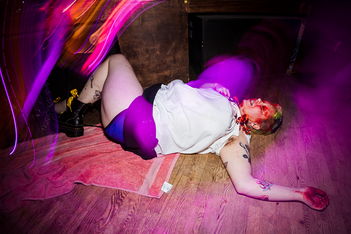
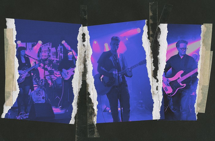
Kanda
w/Library Science, Matt Corwine
Fri April 15, Rendezvous