Comments
Please wait...
Comments are closed.
Commenting on this item is available only to members of the site. You can sign in here or create an account here.
Editors' Picks


is a proud member of the
 media network
All contents © Index Newspapers LLC
800 Maynard Ave S, Suite 200, Seattle, WA 98134
800 Maynard Ave S, Suite 200, Seattle, WA 98134
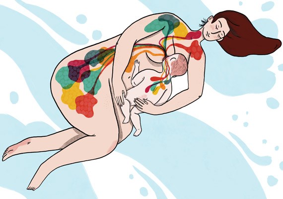
Where does life begin on that thing? Obviously, there are varying opinions (e.g. the abortion debate) but these could all be labeled in different spots or zones.
You misspelled "ganglia" in Cranial Sensory Ganglia under the Neural Crest category. I'm not trying to nit-pick, I swear. I would hate for your thesis to be rejected because whoever it is that reveiws theses is nuts about ganglia and would be mortally offended by the slip. And it would be all my fault for not pointing it out.
So brains and tooth-stuff are first cousins. No wonder it hurts when it hurts!
Feel free to use it on Wikipedia.
RonK: From an evolutionary standpoint, it makes a great deal of sense for brain and skin to be, also, closely related. The entire sensory system started as specialized areas of simple organism's outer envelopes. The brain is just an inward growth of these early attempts.
Just wondering.
Pluripotent stem cells are modifications of the ones you show, so that's in the right section, but it's not like they tend to occur naturally, as opposed to actual stem cells.
I really hope the next century is to life sciences/molecular biology/I'm-not-sure-what-the-term-is what the last century was to physics...
It's like they put Byron in a baby and instead of literature, he wrote the bible.
In fact, I've done that where I know how the arrows should be weighted--during our directed differentiation protocol that takes pluripotent stem cells to
1. mesendoderm
2. mesoderm
3. lateral mesoderm
4. splanchnic mesoderm
5. cardiac mesoderm.
In actual development, I'm not sure if anyone knows how the arrows are weighted (or, perhaps even the 'good enough' weighting of the arrows to get offspring.)
The map itself is still under some contention. A fellow scientist here in Seattle--Dr. Horwitz--is using a really clever trick to cleanly define these connections.
It's all alive.
God I miss science!
I didn't agree with everything in The Visual Display of Quantitative Information, but it really is a beautiful reference and cohesive graphical style manual for scientific figures.
I share Tufte's disgust for pie charts.
And I share Tufte's disgust for PowerPoint, and the Microsoft-fueled culture of Orwellian stupidity and mendacity:
http://www.units.muohio.edu/technologyan…
Frühlingsgrüße aus Hamburg!
info graphics are such eye candy.
are the tissues descended from those headings more different from the parent than in other areas of the figure? just curious. evo/devo isn't my thing.