Art is rarely free of gamesplaying, of a strategically marked-out position that the artist can work from, of some role that defines readings and defends the value of the work. Tennis' position for this show is dumbness. In his cogent, helpful artist's statement (these two adjectives apply to almost no other artist's statement) he writes that he's "the kind of person who's struck dumb by a child's painting or a little canvas-board winter landscape with birds, and thought it odd that after 15 years or more of 'painting' I'd never sat down and tried to make a 'picture.' So I did, literally sit down and try."
The results of this experiment are currently on view at Grover/Thurston Gallery. The exhibit is dominated by a line of small oil paintings, stretched along one wall, of various subjects: an undressing girl, a dog, a view of lower Manhattan from the Staten Island Ferry, a horse, an American flag, a Buffalo industrial plant, and so on. Little unifies the paintings' subjects, save our assumption that Tennis liked them and wanted to preserve them in paint. The 13 paintings that form the spine of the show are consistent, and identical in size and orientation, even as their subjects shift from animals to landscapes to still lifes. Each has a varied shade of blue as background, whether the blue is a summer sky or a bedroom wall; this color is the color of melancholy and reverie, and sounds a perfect sentimental note within the gallery.
His presentation is straightforward. The subject is centered, unless it's looking to one side, in which case it's shifted to the opposite side of the canvas. The subject is presented as a whole, not as a detail; is lit by a single light source; and is painted in relatively flat tones, carefully and skillfully, but without a lot of detail. He doesn't ape the crude style and shaky perspective of a self-trained artist, which would make his position false and lead him into pure gamesmanship. Rather, he paints the way he tends to paint, loosely but well.
Tennis writes, "You can paint anything as long as it's something you like or love or maybe have mixed feelings about"--a generic statement that happens to be true, but also an idea far too simple and sincere for most contemporary artists. It takes guts to paint a dog, to make an entire painting whose only figure is a dog. To paint a dog should require only sincerity: I like this dog. Instead, it now requires irony: Other people, self-taught artists, like to paint their pets, because they love their pets, so I, an academically trained artist, will paint my dog as well. Because I am academically trained, which you can tell by my skill, or failing that, by my resume, you can assume that I would never paint a picture of my dog--unless I was making a larger point about the culture, about high art vs. low art, using the typical device of irony.
But in these paintings, the ironic distance is not very distancing. Tennis does love that dog, and the painting of the dog (Loopy) looks simply like the painting someone who loved a particular dog would make. And Tennis addresses this as well: "I like the idea of a painting posing as a joke to hide how corny and heartfelt and everyday it actually is. It's like it has a protective shield...."
Tennis decided to paint what he likes, to paint it well, give it a little protection, and send it out into the world. How perfectly direct; how perfectly loving; how perfectly dumb.
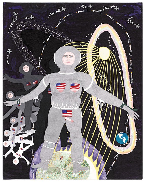
Keen-eyed readers may note that Mr. Tennis appears twice in this issue--once in this review, and once as the illustrator of the Queer Issue features. On a past occasion when I wrote positively about Tennis' work, a reader wrote in to accuse me of having a conflict of interest, as Tennis is a frequent contributing illustrator to the paper. This is untrue by any definition of the term. I have no "interest" in Tennis' career, meaning I don't profit by his gains. I also don't choose who does the illustrations for The Stranger. That's Design Director Joe Newton's job. And as Joe selects illustrators and photographers from the same pool I select many of my review subjects from--Seattle artists--some overlap is unavoidable.
