Experience Music Project, 367-5483.
Through Sept 7.
The problem with an exhibition of rock posters is that postering is messy, and exhibitions tend to be neat. This, in critical parlance, is a frame problem, and EMP has been saddled--and in turn, has saddled a few exhibitions--with a frame that is too bland, that tends to turn the chaotic, emotional experience of music into something neatly patted into a manageable shape.
Last year's LP Show mostly overcame this problem with excess: hundreds of album covers given over to an organizational scheme that was at least as intuitive as it was thematic or chronological; a riot of visual information, nostalgia, and implied sound. Jacob McMurray, the curator of Paper Scissors ROCK, has chosen another route, which is to use Grunge Lite as the exhibit's loud soundtrack. I hadn't recognized it at first; had thought, in fact, that it was some sort of manipulative device imposed by the higher-ups at EMP to move us through the galleries faster. That organ line can make you a little crazy. But this, as it turns out, is how McMurray kept the show from descending into sterility. "I wanted to keep it a little uncomfortable," he said--and he's right. I admired the intellectual integrity of the decision, even as my temples pounded.
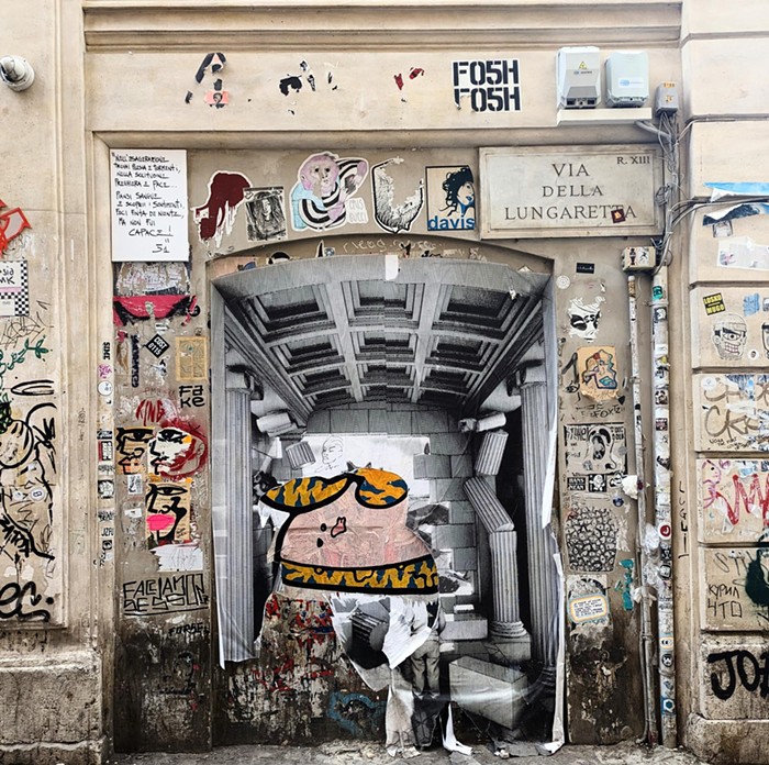
Blending intellectual and philosophical reflection into a show that chronicles something more visceral--the roots of the Northwest poster style are in '70s punk rock, after all--is another kind of challenge. And you know how grating it can be to have something analyzed as it's still evolving. But McMurray pulls it off by acknowledging the split between the poster as fly-by-night bit of information and the poster as fetish object, and also acknowledging that the split doesn't always apply. He credits the arrival of nicely printed limited-edition posters to Austin designer Frank Kozik, who worked for Sub Pop and C/Z Records in the early '90s; the show is a mix of framed posters (both collectible and collected the old-fashioned way) and extra-wide curved surfaces on which lots of posters have been stapled, almost like a telephone pole, but of course not quite. One of my favorite posters is for a 1990 Nirvana show: just the band name and the name of an Olympia club, written not very neatly in capital letters, stapled at the edge of a tangle of other posters, the corner ripped clean off.
This is how the show itself keeps from bland academics--by refusing to handle the subject too delicately, but not denying the art of it, however anarchic. It's not afraid to go into the details of production, from scissors and tape to silkscreen, and features a couple of design models that are instructive if you're interested in graphic design advances, or even if you aren't. In an Art Chantry paste-up for a Gang of Four poster, you can see how he's agitated the type by cutting the letters into pieces and then almost realigning them. I remember a lecture Chantry gave in the early '90s about certain effects he couldn't get a computer to reproduce (with rub-off type, for example); seeing this thought in action allows you to pause and consider what has come and gone.
Collectibles notwithstanding, the poster is still a temporal art, so that pausing and considering are activities that work in opposition to its usual ephemeral nature--thinking about how something is made instead of just what it tells you. Both Chantry and Jeff Kleinsmith did a fair amount of work that pulled back the veil on printing, with images deliberately out of register, or blown up so that the half-tone dots become part of the image itself. These are lessons, both visual and philosophical, drawn from pop art: emphasizing the banal everyday, so that it acquires a new kind of (usually ironic) stature.
And irony abounds. Illustrator Ed Fotheringham, who frequently worked with Chantry, made his name using a blotted line-style from Warhol's pre-pop advertising days--that is, before the advent of irony's pervasive heyday. There's a beautiful 1995 Fotheringham poster for a Girl Trouble show, a narrow, elegant woman's shoe with a broken heel, that represents both the opposite of the aggressive, appropriated, cut-up poster of the '70s and its logical conclusion: self-conscious, clean, appropriated, somehow both inevitable and new.
