Comments
1
They should make sure they're not taking pages out of the Bellevue Art Museum's playbook, because that didn't end up working out so hot.
2
There's enough big old money on Bainbridge that if they 've got the funding commitments they might as well.

3
It has been in the works for years now - things happen very slowly on The Rock.
4
Oh, for God's sakes. They'll never even see one another. Secondly, it's hardly a TOTAL rip off. Bainbridge's "logo" (that's being generous) is three colors and varied typefaces. Tacoma's is two colors and a single thinner typeface. So much for "total." I hope neither fine institution paid anyone to do these "logos" since they amount to three typed words each which any fool could do in a simple word processor. And, yeah, two of those words are the EXACT SAME WORDS!! (Shock!)
5
Jen, you are unfair on the logo thing; neither brand treatment is at all original. Check this out: http://albertsondesign.com/wp-content/up…
6
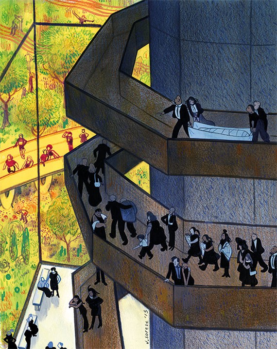
it's a redux redux. the brooklyn academy of music - better than the lame west coast BAMs, especially that red abortion designed by steven holl
Please wait...
Comments are closed.
Commenting on this item is available only to members of the site. You can sign in here or create an account here.
More In Visual Art

Editors' Picks


Popular Articles
is a proud member of the
 media network
All contents © Index Newspapers LLC
800 Maynard Ave S, Suite 200, Seattle, WA 98134
800 Maynard Ave S, Suite 200, Seattle, WA 98134