It's time, Seattle. After receiving over 130 submissions to redesign Seattle's ugly official city flag, The Stranger's esteemed panel of crackpot vexillologists has determined 10 finalists. Now it's up to you to decide which of these flags should be our new (UNOFFICIAL) Seattle city flag. We're calling it the People's Flag of Seattle, because while we strongly encourage Mayor Durkan and the City of Seattle to adopt our new flag, we have low expectations for this administration.
Are you ready to see them? Make sure to keep track of which flag is your favorite and vote in the poll below by 6 p.m. Friday, August 9. Remember, there are prizes on the line. The winner receives:
Fame Four tickets to the Seattle Art Museum ($119.96 value; valid one year) A one-year "Supporter" level membership for two people to Town Hall Seattle, including a voucher for six free tickets ($60 value) Two tickets to any regularly scheduled tour or lecture by the Seattle Architecture Foundation ($36 value)
And now… our 10 finalists!

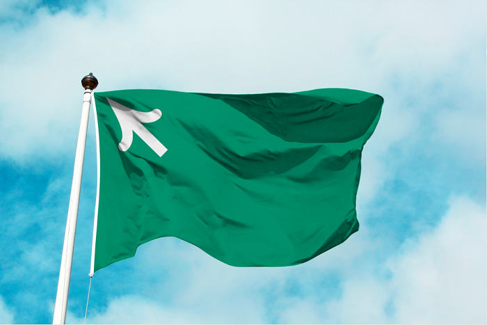
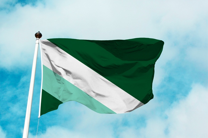
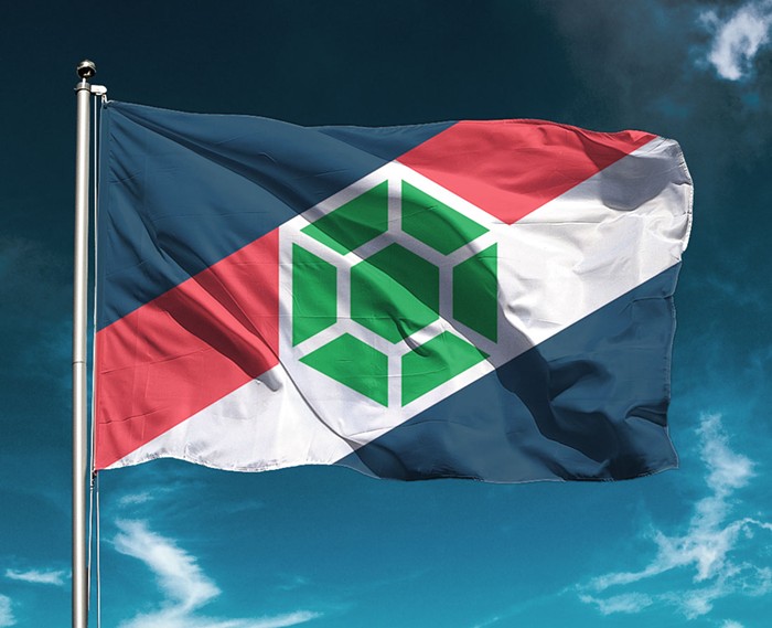
"This flag leans hard into our natural affinity in the region for the greenery and growth surrounding us. But it’s also doing double-duty, a compass arrow, pointing the way northwest," writes Formidable.
More from them: "Formidable Design is the design arm of Formidable, a Seattle-based software consultancy and open source software organization.
We’ve been headquartered in Seattle our whole life. And we’ve had to look at that flag our whole life. It makes us sad. :(
Our team of four designers has come up with three flag variations that we think each better represent Seattle’s best qualities – its relation to the natural environment, its forward-thinking values, and its can-do spirit.
We hope you enjoy our work."
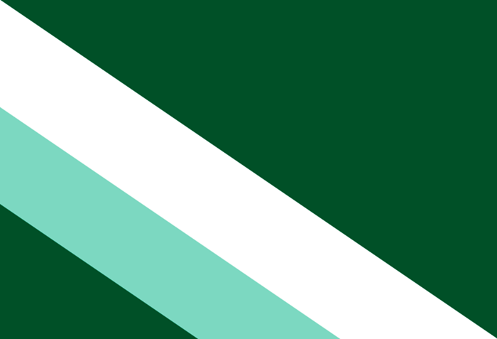
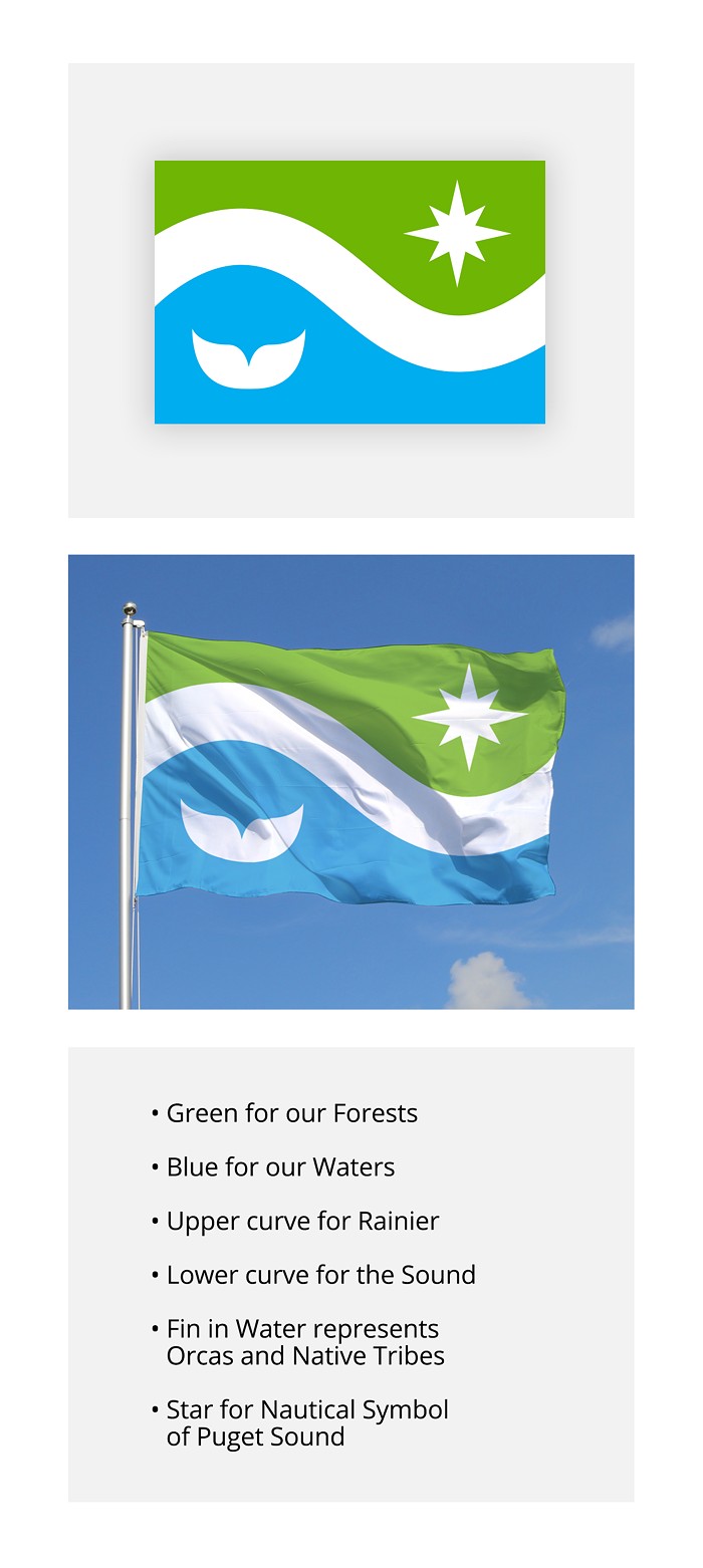
"This option is a nod not only to our northwest position in the country, but our forward-thinking region. Be it in aerospace, tech, or in social issues, our region is always onward and upward. The stripes are situated between two vast expanses, much like our region is surrounded by water."

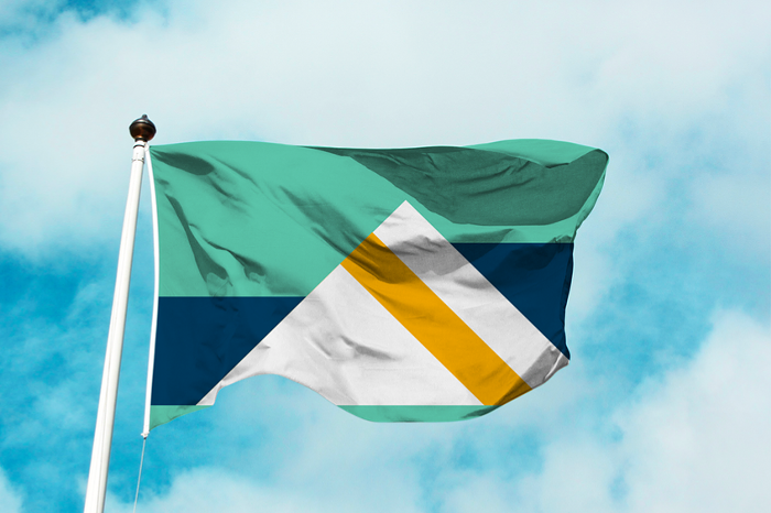
"No flag option would be complete without the great presence surrounding us, the silent sentinels that remind us of place. The mountains here are complimented by the waters that surround them – in this case, waters of varying height, that speak to our sometimes off-kilter lifestyle."
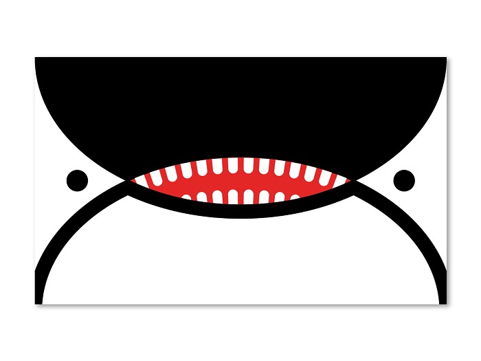
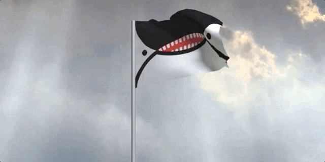
"Big old orca face. Our most precious marine mammal."

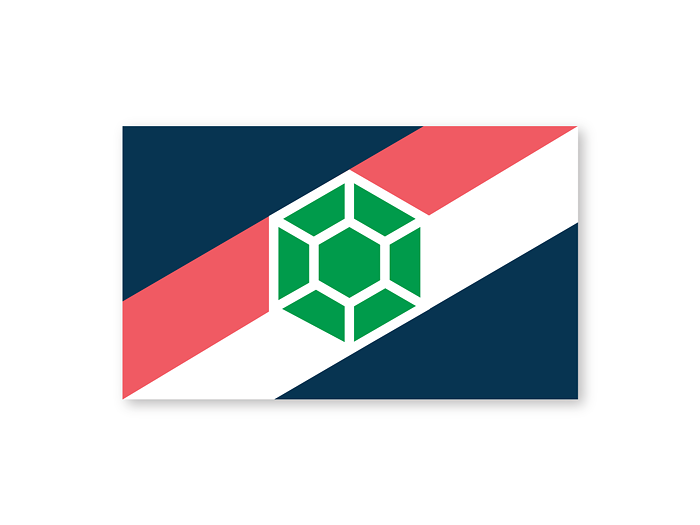
"This design is a mashup of my own design, combined with a variation on a triangle design proposed by Alex Garey in 2015. I proposed this design a year ago, and the city council members blew me off. Maybe with the new council, we can make something happen. (BTW, this design is available as a GIF sticker in Facebook and Instagram stories! Just search 'phillustrations.')"

"This Seattle Flag design has the following embedded symbolism:
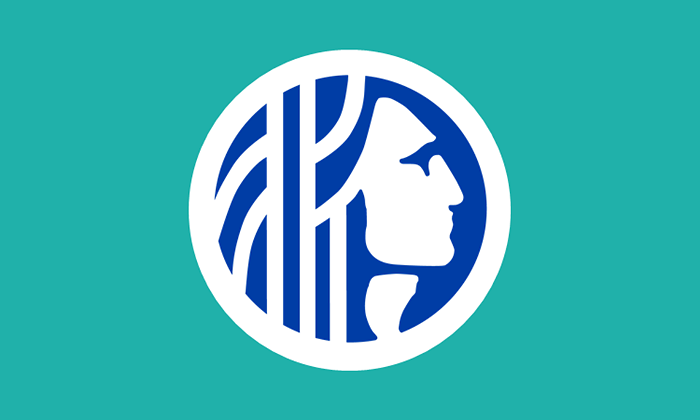
"Seattle is named for Chief Sealth and his profile is already an enduring symbol of our city. Seattle is built on the unceded ancestral land of the Duwamish people, a people who are still here. My design honors Chief Sealth and the ancient heritage of the Duwamish people. He is facing to the right, looking forward rather than backward in the city’s existing seal. The sea green and deep blue colors represent the confluence of salt water and fresh water that define Seattle’s geography."
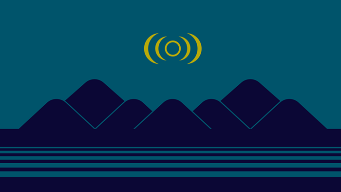
"There are three principal elements:
Colors: The background color is a variant of the turquoise used in the current flag. It is paired with a monochromatic pairing for the hills, and a triad yellow for the crescent."
"My design for a new municipal flag for the city of Seattle, Washington. I've named this design "The Emerald Isthmus" based on Seattle's nickname and geographic location. I designed this back in June when The Stranger first called for a city flag redesign. I've designed a few official city flags in Washington and myself and others are even in the process of proposing a new flag design for Washington State itself. But let's focus on the task at hand: Fixing this horrible city flag."
There you have it, Seattle! Now go forth and vote for your new People's Flag of Seattle.
WHO WON? WELL, IT'S COMPLICATED.