After months of stepping off trains and feeling completely lost, in May of 2017 I threw a hissy fit over the subpar wayfinding strategies Sound Transit employs in the light rail stations. Though I love the light rail with all my heart, my complaints were many: ST was initially stingy with directional signage, the directional signs that did exist pointed riders to streets nobody knows, the buttons in the elevators didn't make any sense, and the station logos resisted the intelligence almost entirely.
Earlier this week I followed up with a representative from the regional transit authority to see if they took my criticisms seriously. Their answer was basically, "Uhhhhh we've done some stuff, but we're workin' on it."

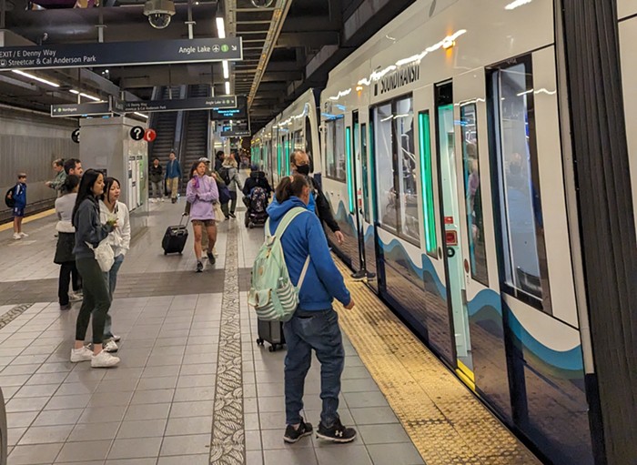
In an e-mail, a representative says in June of this year Sound Transit updated directional signage in the Capitol Hill Station to include "Cal Anderson" on the "E Denny Way" signs. They also added "Olive Way" to the "Broadway E & E John St" signs. Both of these additions are directly responsive to my criticism that "E Denny Way" is meaningless, and that "Broadway E & E John St" is, for the local, emotionally, Olive Way.
That said, both signs are STILL confusing. Cal Anderson Park and the Streetcar are on opposite sides of Broadway. While it's true that the E Denny Way exit will take you to the Streetcar, it's not the most direct route to Cal Anderson. The exit that actually takes you to Cal Anderson is the Broadway E & E John St/Olive Way exit, which is now just a confusing jumble of words vaguely suggestive of streets. *Update* There is an exit to Cal Anderson from the E Denny Way mezzanine, but you have to go up hard-to-see stairs or use the elevator. If I were directing someone to the Streetcar, which I would never do, I'd tell them to take E Denny Way. If I were directing someone to the park, which I would do, I'd tell them to take the Broadway E & E John St/Olive Way exit and hang a right, but I wouldn't be able to say all of that without cussing. So, thank you for earnestly engaging with the public, Sound Transit, but these additions make the Capitol Hill Station even harder to navigate.
In a more useful move, ST plans to add explanatory labels next to their inscrutable elevator buttons. At the beginning of 2019, you'll see the word "Platform" next to the "P," the word "Surface" next to the "S," and the word "Mezzanine" next to the "M." This improvement will slightly allay the fear of being dumped into some unknown parking lot when you press the "P" button in the elevator.
As for future improvements, ST will complete a review of wayfinding strategies used by other transit systems (e.g. numbering exits) and "formulate recommendations" for their own approach by the end of 2019.
The transit authority will also "continue to conduct research and tests to better understand the points of confusion customers experience when using our system." They're currently using Virtual Reality to test proposed signage changes in the Westlake Station, and they'll use the results to "inform a more holistic approach" to improving signage.
Sound Transit did not immediately respond to my follow-up questions on their use of VR for wayfinding. I have no idea why they feel the need to use that kind of technology when they could obviously just buy me a six-pack and ask me to walk around the stations and shout about what kinds of signs I'd want to see like the provincial drunk uncle I truly am.
To defend their use of seemingly illogical station logos, Sound Transit explained that an artist (and a "public engagement process") created them. The pictogram creation program was called "Stellar Connections."
Presumably to avoid stirring up some kind of political brouhaha, community members in each neighborhood along the light rail picked various "points of interest" near their own stations. The artist then drew lines between those points to create constellations, which were then fleshed out into the confounding icons you see today. The points of interest for the Columbia City station, for instance, are Columbia Park, Carnegie Library, Rainier Valley Cultural Center, Ark Lodge, Orca School, 1881 Site, and Hitt’s Hill Park. Connect those points together on a map and you get an M-shaped line that "evokes the actual constellation 'Columba,' the dove," according to Sound Transit. And that's why a dove has come to represent Columbia City Station on Sound Transit's maps. Got it? Good.
Now lose it. Though they still ask for public input, Sound Transit will not continue to use this stellar design idea going forward, which means that the same design logic will not govern every station logo. Truly amazing.

