beautiful-ohiojpg-267626167dad6f33_medium.jpg

I would like to talk about the ugly new design for Ohio’s license plates because I care about design and because I am from Ohio. (Cleveland, specifically.)

Ohio’s old license plate design wasn’t amazing, but it was better. That design is known as the “Birthplace of Aviation design”. (You may ask why we are called “The Birthplace of Aviation”. It is because the Wright Brothers were born in Dayton, OH. [Yes I still identify as an Ohioan… which only gets my poor mother’s hopes up that I will move home.])

This new plate is just a monstrosity of shapes and colors. It’s a classic case of too much going on. The message is “OMG Ohio is SO AWESOME look we have farms and fields and cities and colors and also the Wright Brothers were born here and also we have this logo!” And I am not a fan of the new Ohio logo… again, I didn’t love the old one, but the new one is just TOO MUCH.

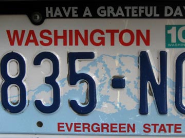
I think Washington’s plates are nice. Not great, but nice. Certainly better than some of the plates out there. Certainly better than poor Ohio’s new plates.

Remember when plates were just a solid color with the state name on them? I like those. Simple. Functional.

Anyone have a vote for the best/worst plates in the union?

53 replies on “Oh, OH!”

  1. I favor the old style plates, too. The Colorado Rockies, the Montana state shape, the New Mexico exotic colors. I also liked it when the license plates, cabs and street signs in New York were all yellow and black. But my favorite old style plate is the Wyoming cowboy on a bucking bronco.

  2. Cleveland? Oh, Mary, you have my sympathy. (I was there when the Cuyahoga burned, by the way. Yes, I know I’m dating myself.)

    I’m with @1 – I like the old-style plates better too.

  3. I so miss WA old green and white plates. When my family moved to California in the early 90’s, my dad hung our old WA plates in the garage and I would imagine getting my car and putting those back on it.
    Of course, I grew out of wanting a car, but I still want to hang those old plates on my wall at home.

  4. @5 Only Cleveland could turn that into something to celebrate… Great Lakes Brewery has the delicious Burning River Pale Ale.

    Also, remember the black-out of 2004? That was us too. We took out the whole northeast section of the country and part of Canada.

  5. Worst plates have to got to be the new Utah plates. Besides the ugly psuedo-Western lettering for the state name, the colors clash.
    What I first thought looked like (fake) cheap wood paneling across the top turned out to be red-rock petroglyphs on top of a skier, with the lame tourism campaign slogan of “life elevated”.
    Not sure if they were referring to the amount of meth or anti-depressants or heavily-sugared green jello consumed here…
    http://dmv.utah.gov/plates/skier_large.j…

  6. If Ohio changed the state motto to “Werewolves of London” and stamped it at the bottom I’d give it a serious thumbs-up.

  7. I like Virginia’s just for the typeface. Simple plate design, but still distinctive.

    If we can include our neighbors to the north, however, the Northwest Territories have a polar bear plate. How can you beat that?

  8. Among current plate designs, Colorado’s high-contrast green and white mountain theme is my favorite: It’s clean, it’s legible, and it’s visually interesting.

    Our current Washington plates aren’t bad.

    Simple, old-school designs are my overall favorite, though.

  9. License plates shouldn’t have fonts on them. License plates are not advertisements. The letters and numbers should be plain, and stamped into the metal. That Ohio plate is the ugliest thing I’ve ever seen. That cursive, those colors, that airbrushy effect — it looks like a MySpace page.

  10. Back in my youth, all states had a simple 2-color plate. Each state had a different color combination. In part, this was intended to help police. They could easily identify the state a license plate was from, even at a distance. Now, of course, with the plethora of designer plates out there that seem to be constantly changing, easy identification at a glance is no longer possible. It’s not only ugly, but it makes police’s jobs more difficult.

  11. @20 Fifty-Two-Eighty is right, it’s a tree whose nuts resemble the eyes of bucks. It’s also a delicious candy made of peanut butter and chocolate.

  12. (in no order)

    Worst plates: New Jersey (which appear to advertise that the state’s colors are white and piss-yellow); Missouri (the teal-blue-green thing and the lack of anything that might be representative of Missouri); Delaware (for having illegible color schemes – gold on dark blue just doesn’t cut it.) California (simply for being boring); Montana (the new white-on-blue looks like US government plates). Honorable mention: this Washington (for having no green whatsoever on plates that say “Evergreen State”); that Washington (“Taxation Without Representation”? For a license plate? In the capital district? Seriously?)

    Best plates: Montana (the recently-deceased Big Sky Country plates were terrific); New Hampshire (‘Live Free Or Die’? ‘Nuff said.); Arizona/Texas/New York (pretty and relevant designs, great color schemes). Honorable mention: Alabama (“Sweet Home Alabama”) and Colorado (such traditionalism elevates this plate to popular-icon status).

  13. Gotta represent my home state – I’ve always liked Maryland’s plates. Black and white, state seal, done. Classy.

    The standard plate hasn’t changed since I was a kid, though of course now they have all kinds of alternative options, which are generally hideous.

  14. Mary @28: I’m always right. You’ll find it gets pretty annoying after a while.

    Rhode Island’s plates are really cool too – a sailboat on a white background. Not that you’ll ever see very many of them.

  15. Washington’s plates SUCK…they are the epitome of design by politics rather than design for design’s sake. Some kid designed them (ahhh…so kewt!), and the view of Rainier is as seen from the east side of the state, so as to appease the easties…and seriously, red, white and blue?…and those nasty fonts…I want to puke. I like the masculinity of the simple two-tone plates…they are a design that makes sense as a badge for one’s car.

  16. Rhode Island’s standard plates have a subtle grey wave and say “Ocean State” at the bottom. Apparently the sailboat plates are available for an extra fee. I don’t remember seeing them when I lived in Rhode Island. http://www.plateshack.com/y2k/Rhode_Isla…

    I nominate the new Florida plates for a special award in ugly: splashing “MyFlorida.com” over the top is just stupid. I’m glad I don’t have to drive around advertising some website on my bumper. http://www.plateshack.com/florida/fl2005…

  17. @29: i think my DC plates are badass.

    do you see any other state giving their government a bitch-slap on their license plates? nope.

  18. @20, it’s a type of nut. Poisonous, the mascot of Ohio State University, and it hurts when chucked at people.

    @28, Buckeyes are amazing, although my family only makes them at Christmas.

  19. Enjoy those plates while you can. Once our cars (and perhaps our skulls) have GPS-enabled transponders deeply embedded, there’ll be no more such low-tech identifiers and no more shenanigans, let me tell you.

    And, not that anyone asked, I always thought “Missouri Loves Company!” was a great [unused] state motto.

  20. @28

    1 pound butter
    2 pounds peanut butter
    3 pounds powdered sugar.

    Mix in a LARGE bowl. DO NOT, EVER, double the recipe. Invite many people over to help you roll the 500 or so half inch balls. Melt chocolate in a double boiler, add a touch of parafin wax if you don’t want to temper the chocolate. dip the balls into chocolate, leaving the just the tops uncovered. place on wax paper to cool.

    My family across the country expects these in the mail every December. I have probably rolled 50,000 or so of these since 1977 when I turned 5 and Mom asked me to start helping make them. If we had never made that brief trip to ohio in the mid 70’s, I might be a thin person today.

  21. Best are old Idaho plates, green on white with FAMOUS POTATOES stamped on so plainly; it looked like a statement of fact rather than pride. At the opposite extreme I also liked the Ski UTAH! plates for the silly fonts and exclamation point. Colorado has always been nice. Worst are the fugly diplomat plates.

  22. Funny story: The last time I was downtown I saw a brand-new black Caddy parked on the street, Colorado license plate “1.”

    I’m guessing it was the Gov. Who else?

    Yep, Colorado plates are the best.

  23. Have you seen the regionally-infamous Kentucky Sunshine plate? It was the standard plate in my county the first time I got a car, and it looks like Ohio took a page out of its book.

    This was the old standard plate: functional, classy, featuring the spires of Churchill Downs and horse silhouettes, in University of Kentucky blue-and-white:
    http://www.aaroads.com/license_plates/im…

    This is the newer (current? I’ve moved away, but I think it’s the current) plate: chubby-faced sunshine, crazy colors, and an absolutely embarrassing slogan:
    http://www.kentuckyroads.com/images/kent…

  24. Can’t read a dang thing on that plate. It takes too much eye squinting to read the top part and by the time I’ve made it out I probably have crashed into the car ahead of me.

    I love the European license plates. Easy to read and they don’t really bother trying to advertise their country/state/etc. Unlike this monstrosity.

  25. @11: Worked for cingulat&t. Wanted to show some “fondness” for a brand name that was crap from the getgo. Actually, teal and orange are just plain hidjus.

  26. I miss the old plates too, but every time I see the current Kentucky plate, I’m just glad I don’t have to look at THAT all the time.

  27. Best plates today? Let’s go for for North America.
    โ€”> The classic B.C. plates: big, easy-to-read cyphers against white
    โ€”> New Mexico: red-on-yellow is simple, distinctive, easy to read
    โ€”> Ontario: clean and elegant, but simple like old Texas plates were
    โ€”> Minnesota: venerable, decorated but not fussy, soothing on eyes
    โ€”> Saskatchewan: venerable, distinctive, and classic
    โ€”> Vermont: lovely, white-on-green, timeless

    Worst?
    โ€”> Florida: all of them, visual trainwrecks in colour, theme, legibility
    โ€”> Texas: last two generations of crazy, design-by-committee hell
    โ€”> Ohio: this design and the gold one (red/blue was OK)
    โ€”> Michigan: new ones are stark, garish, and depressing
    โ€”> Quรฉbec: just as stark and depressing as Michigan, but dated

    Best of all time?
    โ€”> Colorado: dark green style w/ white mountains, clever
    โ€”> Northwest Territories: die-cut shaped like a polar bear!
    โ€”> California: gold-on-blue of the late 70s/early 80s: timeless
    โ€”> Georgia: the original “. . . on My Mind” variety w/ crescent peach

  28. @7: Actually, that was Monday, 14 August 2003. It’s still imprinted in my memory big time. Nitpicking aside, wasn’t it really an Ohio squirrel’s fault who acted all stupid and got the big fry?

  29. @42 – I was just going to post about the Kentucky “Mr. Smiley” plate. Fortunately it is now defunct – special order plates skyrocketed because so many people refused to have that grotesque thing on their cars. For a while, though, there was a local economic boom in small circular stickers with a gorilla face on them that people would slap over the face of the manically smiling sun.

    Seriously, that thing would be embarrassingly juvenile even as a wall mural at a daycare center.

    Agree on the awesomeness of the NM plate and the statement of the DC plate.

  30. Well 800,000 Ohioans and I love the new design.I went out the first day of issue and bought mine.The 2001 and 2003 plates look like a Dairy Queen Sign And the 1996 Look like some one had rubbed their ass on them and left shit skid marks behind.The blue on white and green on white in the 80’s were ok but a 3 inch Ohio at the top was ugly and why even bother with putting a half inch out line of Ohio in the middle of the plates.From 3 feet back it looked like a dot.I was living in Nebraska in 1976 and they had a beautiful plate,I expected something about the bicentennial on the Ohio plate and all we got was a off yellow with red lettering and only the states name on it in half inch letters not even a year on it.The beautiful Ohio plate is the best looking plate this state has ever produced.I also lived in Washington in 1980 and the green and white plate did the job but there was nothing special about it.On the new one they use the barely can see Rainer.That what I hated about the dull grey sunrise on the 2003-2009 Ohio plate.

Comments are closed.